When it comes to creating a peaceful atmosphere in one’s surroundings, the choice of colors can make a vast difference. The Japanese have mastered the art of using colors to evoke a sense of calm and tranquility in their daily lives. Japanese Zen colors are based on the principles of harmony, balance, and simplicity, which have been integral to Zen Buddhism for centuries. In this article, we will explore the philosophy behind Japanese Zen colors, the meanings behind the hues, and how they can help create a calming atmosphere in our homes and lives.
The Philosophy of Japanese Zen Colors
Zen Buddhism has had a profound influence on Japanese art, design, and culture. Its principles of simplicity, clarity, and mindfulness can be seen in the country’s architecture, gardens, and even the way people go about their daily lives. The philosophy of Japanese Zen colors is rooted in the belief that color has the power to calm the mind and promote a sense of peace and well-being.
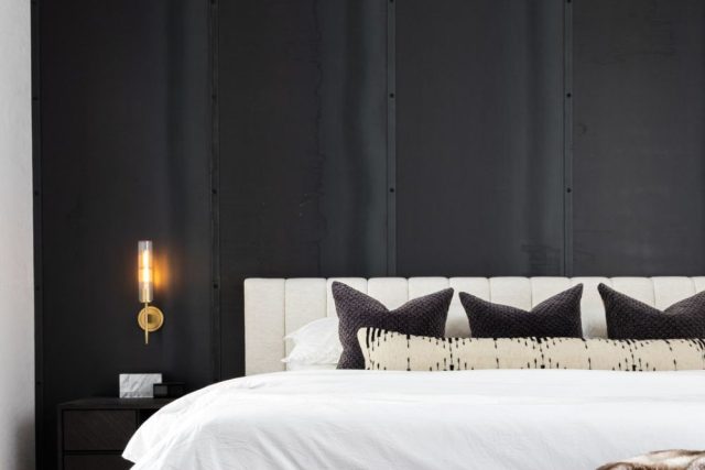
Japanese Zen colors are based on simple, natural hues that draw inspiration from the natural world. The color palette consists of muted shades of green, brown, gray, and blue, with the occasional pop of red, yellow or purple. The colors are chosen for their ability to create a serene and harmonious environment, which is essential for achieving a Zen state of mind.
The Meanings Behind Japanese Zen Colors
Each color in the Japanese Zen palette has a unique meaning and symbolism. Understanding the meanings behind the hues can help you use them more effectively in your home design and decor.
Green: Green is the most common color in Japanese Zen colors. It is associated with nature, growth, and new beginnings. It is a calming color that promotes tranquility and balance.
Brown: Brown is a warm, earthy color that represents grounding, stability, and simplicity. It is often used in flooring, furniture, and other natural materials.
Gray: Gray is a neutral color that represents balance, stability, and wisdom. It is used to create a calming and serene atmosphere.
Blue: Blue is a cool, calming color that represents the sky and the ocean. It is associated with serenity, peace, and trust.
Red: Red is a vibrant, energizing color that represents passion, love, and power. It is used sparingly in Japanese Zen colors to create a sense of excitement and vitality.
Yellow: Yellow is a bright, cheerful color that represents happiness, optimism, and enlightenment. It is often used in smaller accents to add a touch of warmth and light.
Creating a Japanese Zen Color Scheme in Your Home
Incorporating Japanese Zen colors into your home design can help create a calming and relaxing atmosphere. Here are some tips for using the hues effectively:
1. Start with a neutral base. Use neutral colors such as beige, gray, or white for walls and large surfaces.
2. Add natural textures. Incorporate natural materials such as wood, stone, and bamboo to add warmth and texture to the space.
3. Use color sparingly. Choose one or two hues from the Japanese Zen color palette for accents such as pillows, curtains, or artwork.
4. Opt for simplicity. Keep the decor simple and uncluttered to create a sense of calm and serenity.
Incorporating Japanese Zen colors into your home design can help create a more relaxing and peaceful environment. By using a minimalist color palette inspired by the natural world, we can evoke a sense of calm, balance, and tranquility in our daily lives. Whether you are looking to create a Zen-inspired interior or simply want to infuse your space with a sense of calm, the Japanese Zen color palette is an excellent place to start.
Hottest Posts
Pendant light
Enhance Your Open Foyer with a Stunning Large Orb Chandelier
Pendant light
Ultra Thin LED Ceiling Light: Perfect for Low Ceiling Apartments
Furniture
Creating a Cozy Ambiance with Hanging Lights in Your Restaurant
Pendant light
Enhance Your Hotel Lobby with a Stunning Crystal Chandelier
Lighting
Capturing the Golden Hour Aesthetic with Glass Ceiling Mount
Lighting
Creating a Relaxing Bedroom with Soft Diffused Light